
PROBLEM AREA
Critical Navigation Failure Threatening Benefits Program Value
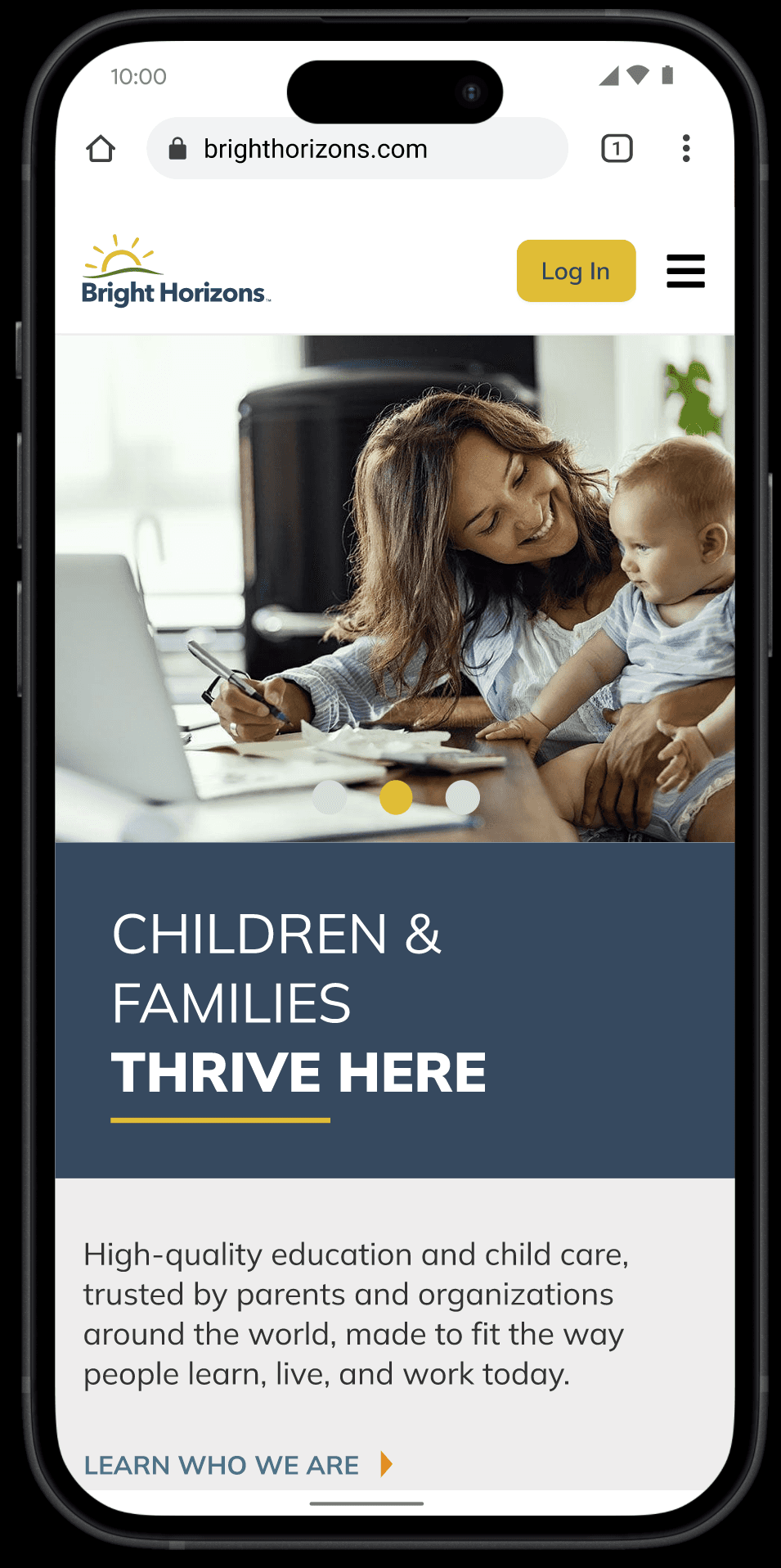
Bright Horizons' benefits platform was experiencing a 70% user drop-off rate during login navigation. Employees seeking childcare benefits didn't understand what "Family Information Center (FIC)" meant and couldn't figure out how to access their specific benefits. They also struggled to distinguish between different benefit portals and understand which login path was correct for their needs.
The Core Issue: The homepage overwhelmed users with confusing terminology and multiple login options without clear guidance. Users simply wanted to access their childcare benefits but faced unclear labeling and navigation paths. This wasn't just a usability problem—it was a business crisis affecting the perceived value of the entire benefits program.
Organizational Challenge: Solving this required coordination between marketing (who owned the homepage) and product teams (who managed the benefit portals), adding complexity to any design solution.
Business Stakes:
Employees couldn't access critical childcare benefits, impacting well-being
Employers questioned ROI of their benefits investment
Program underutilization threatened Bright Horizons' competitive positioning
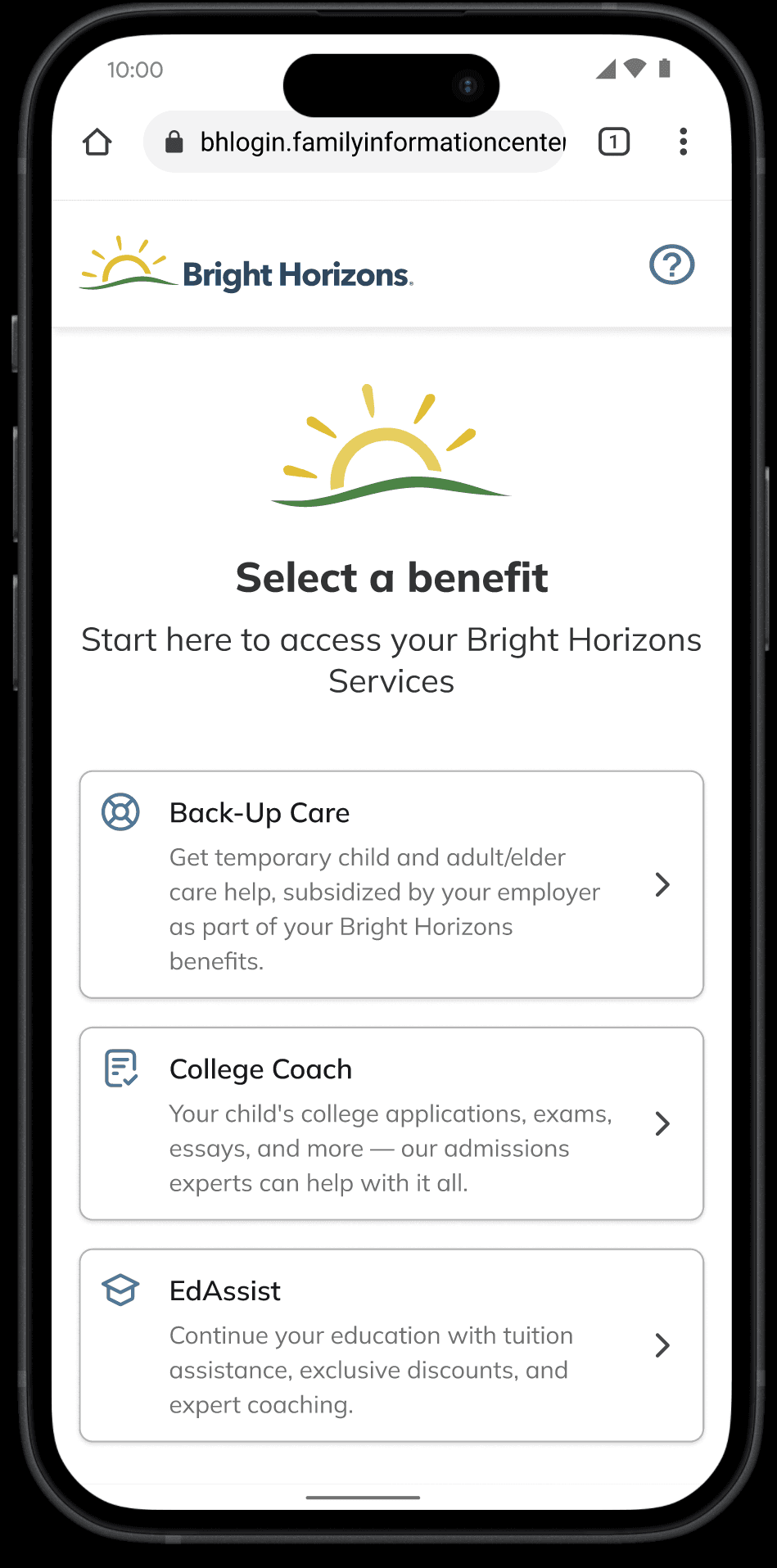
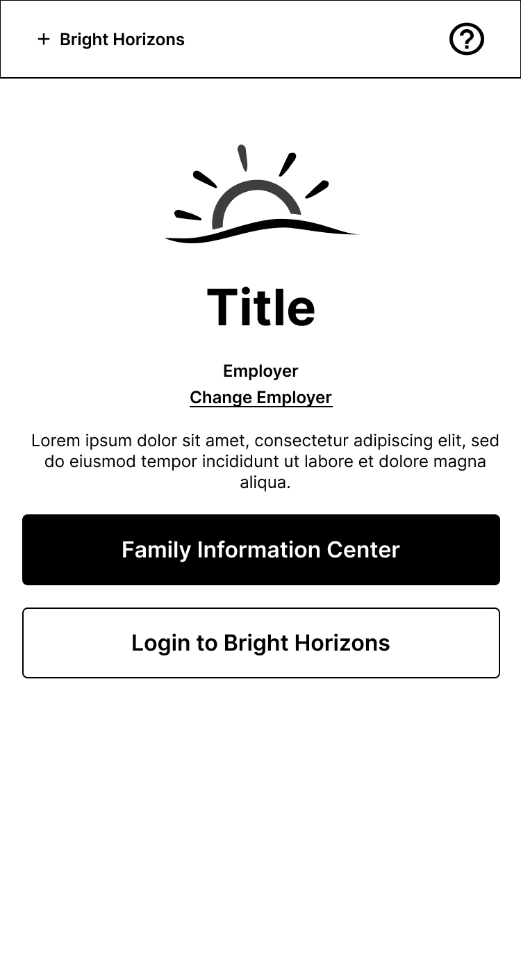
Legacy login page for BrightHorizons.com
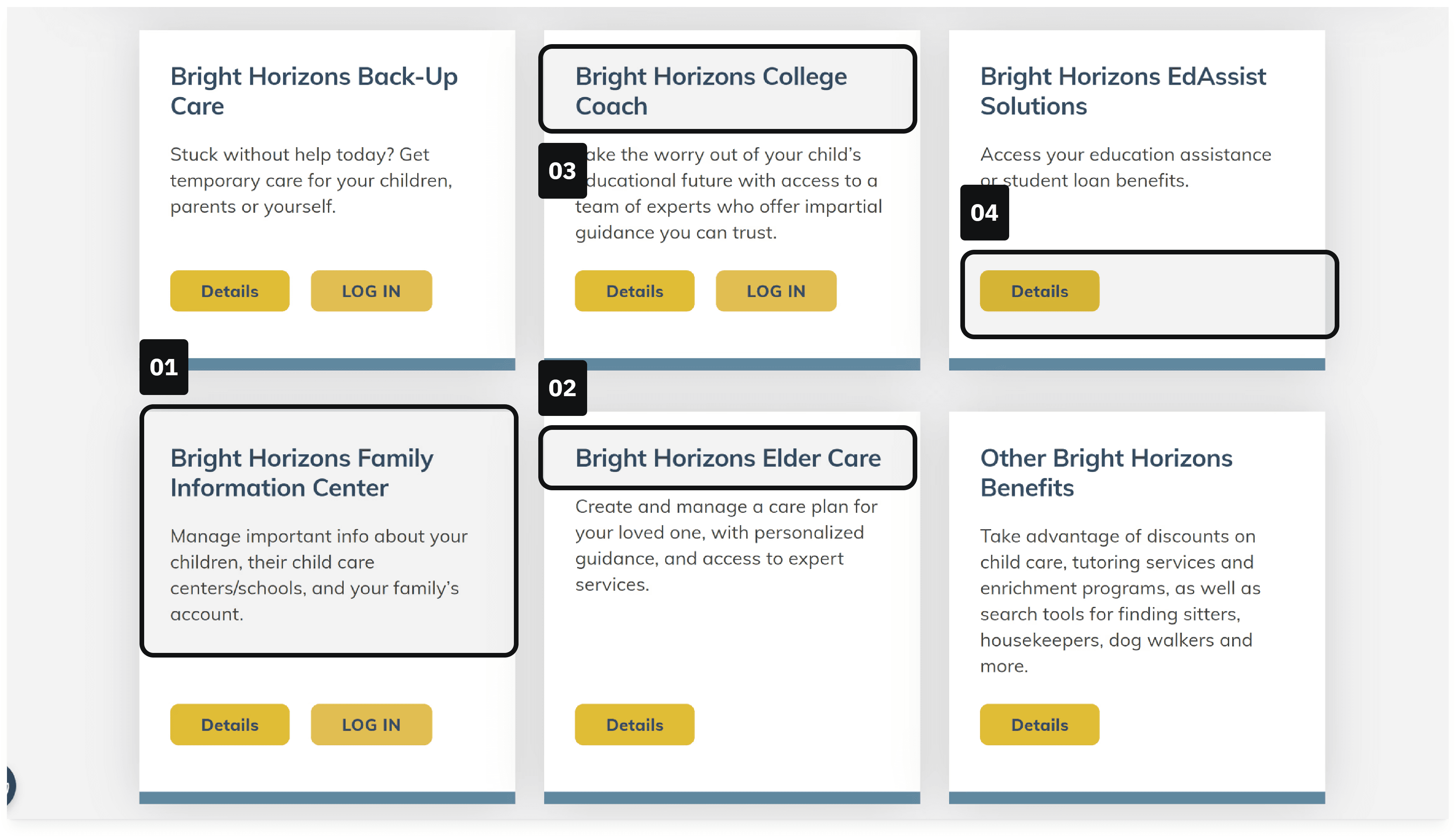
01
Not clear to users that this is the portal for their preschool and day-care
02
Not a service by itself; Elder Care is contained in the Back-Up Care services
03
Often confused with EdAssist and is not always offered by all participating employers
04
No login button; Portal needs the employer before the user can login
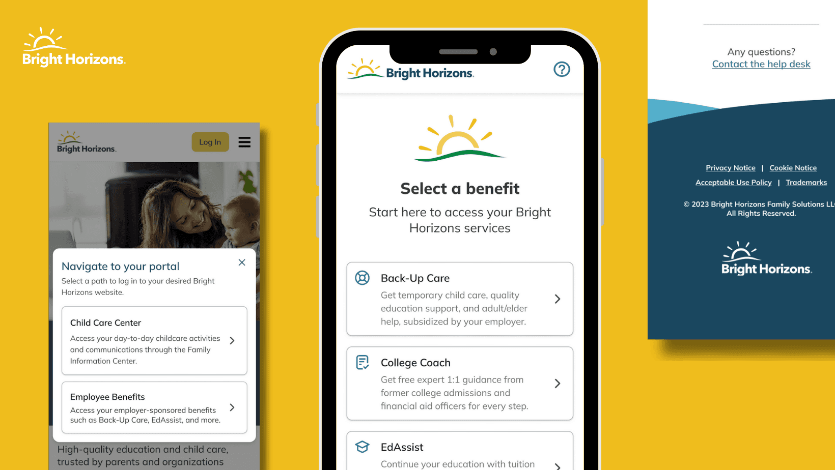
DESIGN DECISION 01
Systematic Flow Design with Cross-Team Coordination
To address the navigation crisis, I designed a streamlined user flow that eliminated confusion while respecting the organizational constraints between marketing and product teams. My approach focused on creating clarity without requiring major backend changes.
Design Strategy: Working with both marketing and product stakeholders, I mapped out a solution that could be implemented within existing technical constraints while maximizing user comprehension.
Modal-Based Solution:
Reduced cognitive load by presenting options in a focused, distraction-free environment
Clear terminology with helper text explaining what each benefit portal actually provided
Accessibility compliance with proper focus management, ARIA labels, and keyboard navigation
Cross-team feasibility designed to work within existing marketing site architecture
Cross-Functional Coordination: The solution required careful collaboration between teams since the modal lived on the marketing site but directed users to product-managed portals. This influenced design decisions around terminology, visual hierarchy, and technical implementation.
Log in flow from BrightHorizons.com
Click Login
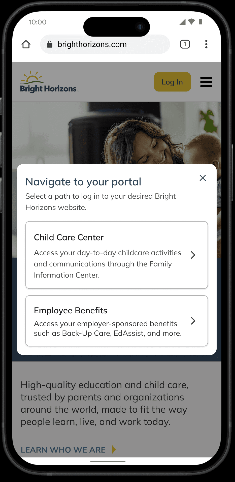
Portal Selection
Benefit Selection
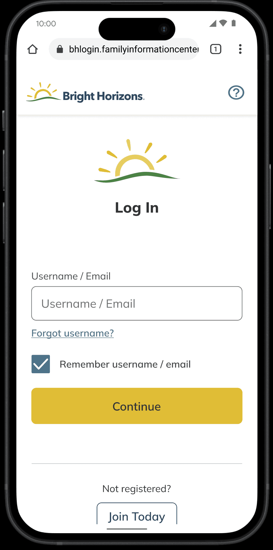
Username
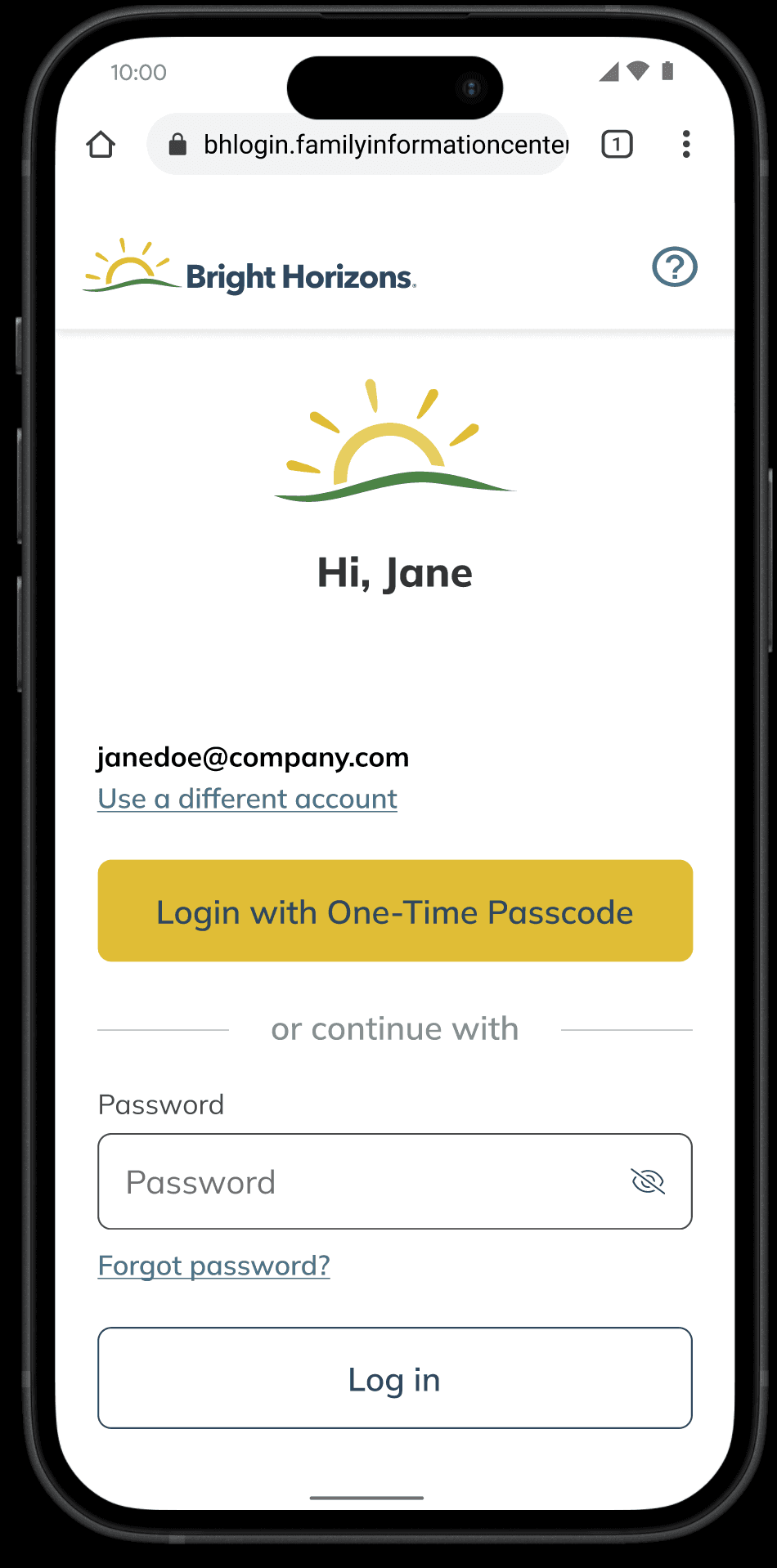
Password / OTP
DESIGN DECISION 02
Choosing Modals: A Focused Solution for Streamlined Navigation
I explored three distinct design solutions to determine which would most effectively solve the navigation crisis while working within technical and organizational constraints. Each option was evaluated for user comprehension, implementation complexity, and cross-team coordination requirements.
Comparative Analysis:
Dropdown Design: Space-efficient but provided insufficient context for complex benefit navigation. Usability testing revealed 0% success rate as users couldn't distinguish between options.
Button Design: Visually prominent with clear calls-to-action, achieving 60% success rate. However, multiple buttons created visual clutter and didn't provide enough explanatory context.
Modal Design: Focused environment with contextual information, also achieving 60% success rate. Users described this as "most intuitive" and it remained within the marketing site flow.
Validation Methodology: Conducted comprehensive usability testing with 15 participants across US and UK markets using UserZoomGo. Tasks focused on login path identification and completion rates under realistic conditions.
Decision Rationale: Selected the modal approach because it balanced user comprehension with implementation feasibility. The solution provided necessary context while requiring minimal cross-team coordination compared to more complex alternatives.
BrightHorizons.com Dropdown
PROS and CONS
Compact
Uses existing components
Hard to find
Achieved a 0% success rate, as users struggled to identify the correct login option
Enterprise Login Button
PROS and CONS
Achieved a 60% success rate
More context
Less cross team dependencies
Not clear from the marketing site where the user with land
Cons of option B
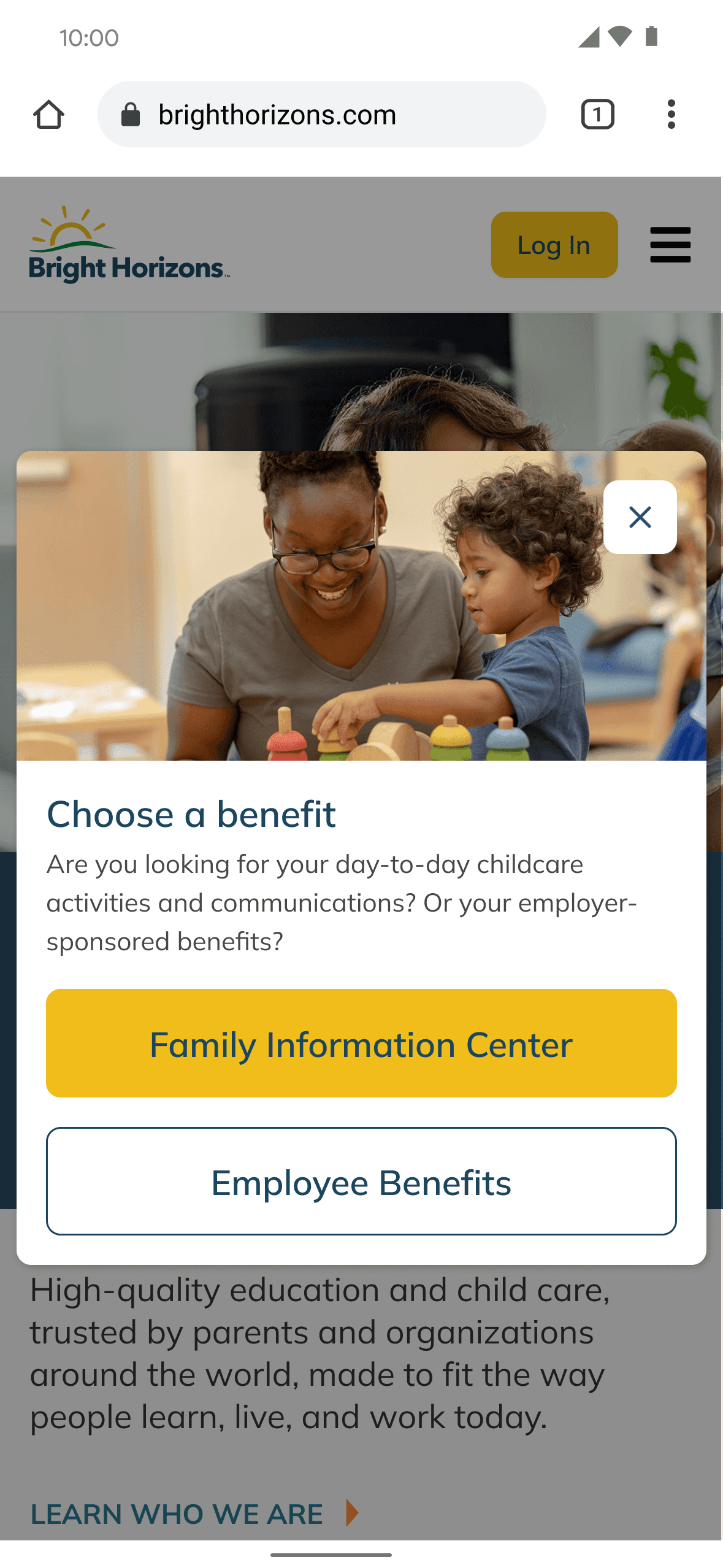
Login Modal on Marketing Site
PROS and CONS
Achieved a 60% success rate
Users referred to this design as the "most intuitive"
Remains on marketing website as to not take the user out of their expected flow
Most context
More cross team dependencies during implementation
DESIGN DECISION 03
Iterative Refinement Through User Validation
To validate and refine the modal solution, I conducted targeted interviews with five new parents actively using Bright Horizons' daycare centers—our primary user demographic. This additional research layer ensured the solution worked for real users in realistic scenarios.
Refinement Process:
User feedback analysis to identify specific pain points in modal comprehension
Copy optimization based on actual user language and mental models
Accessibility enhancement with proper focus management and ARIA labeling
Cross-team validation to ensure terminology alignment between marketing and product
Key Design Evolution:
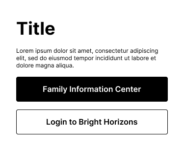
Initial Version: High visual personality but lacked essential user context, causing confusion about benefit types and access paths.
Final Solution: Minimalist, context-rich design that users described as "intuitive":
Plain language approach: Changed "FIC" to "Child Care Center" based on user feedback
Enhanced context: Added helper text explaining what each portal actually provided
Simplified hierarchy: Removed unnecessary visual complexity that distracted from core tasks
Persona flexibility: Generalized language to accommodate different employee types
Validation Results: The refined design achieved significantly higher comprehension rates and positive user sentiment in follow-up testing.
Unclear what these buttons mean and why FIC is the primary
Not all services are employer-sponsored benefits
BEFORE
Lots of personality without context
While the first solution had lots of personality and color, it lacked the context needed for the user.
AFTER
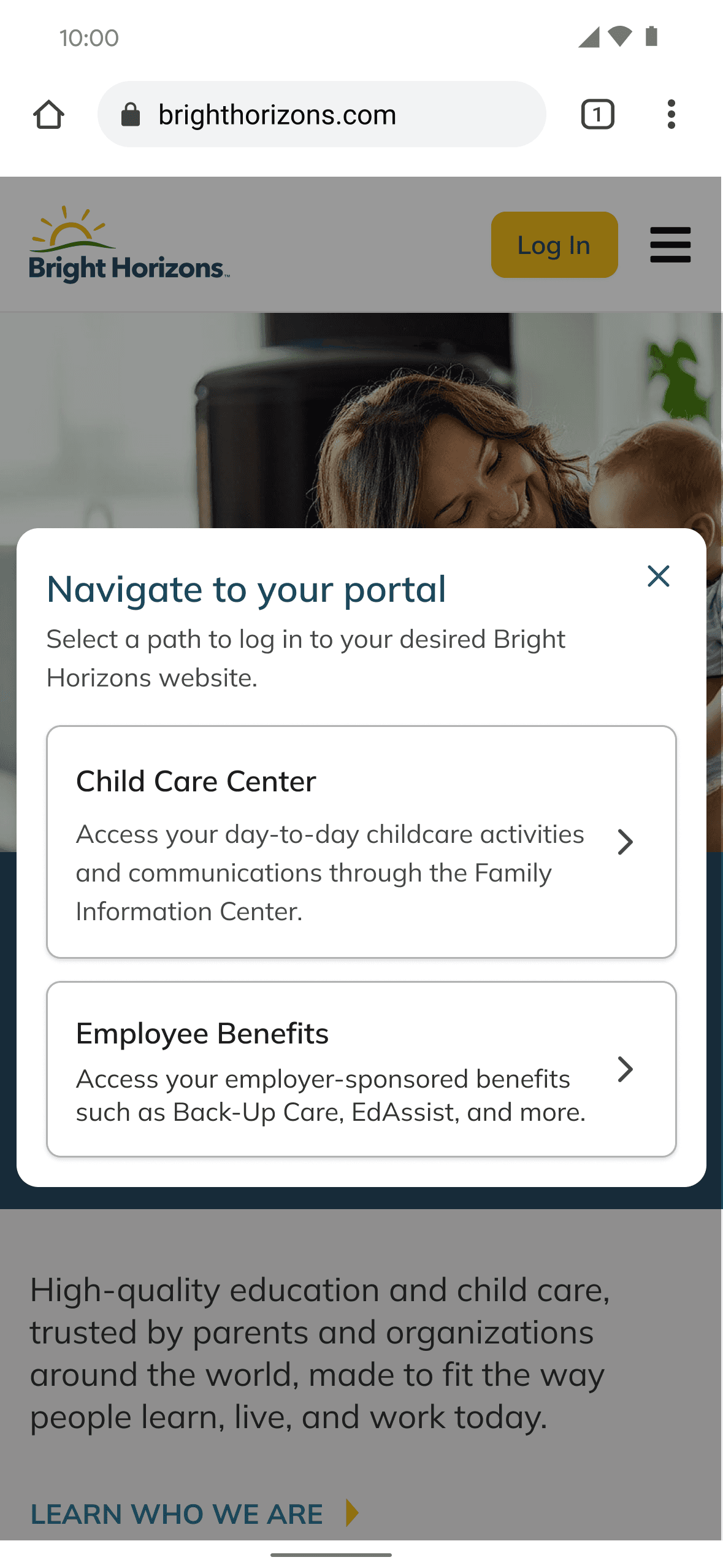
Minimalist became the most intuitive
Removing a lot of distractions and colors became the answer for the most intuitive modal.
Extra helper text for context and removed unneccessary heirarchy of buttons
More generalized to accommodate different personas
Changed to "Child Care Center" for the sake of plain language
RETROSPECTIVE
Cross-Functional Collaboration and User-Centered Problem Solving
This project demonstrated the critical importance of systematic user research when solving seemingly simple navigation problems. What appeared to be a basic UI issue was actually a complex challenge requiring coordination across multiple teams and deep understanding of user mental models.
Key Learnings
User language matters more than internal terminology: Users didn't understand "FIC" but immediately grasped "Child Care Center"
Systematic comparison prevents costly mistakes: Testing three approaches upfront saved significant development time and resources
Cross-team collaboration amplifies impact: Working between marketing and product teams created a solution neither could achieve independentl
Methodology Insights
The most valuable aspect was treating this as a research problem first, design problem second. By understanding exactly why users were failing (terminology confusion, not visual design), we could create a targeted solution rather than a complete redesign.
70%
Decrease in user drop-off
35%
Increase in user satisfaction
90%
Users able to self-correct eligibility errors on login
7%
Decrease in login related support tickets
Danielle Pirone
Enterprise Product Manager
Featured Case Studies
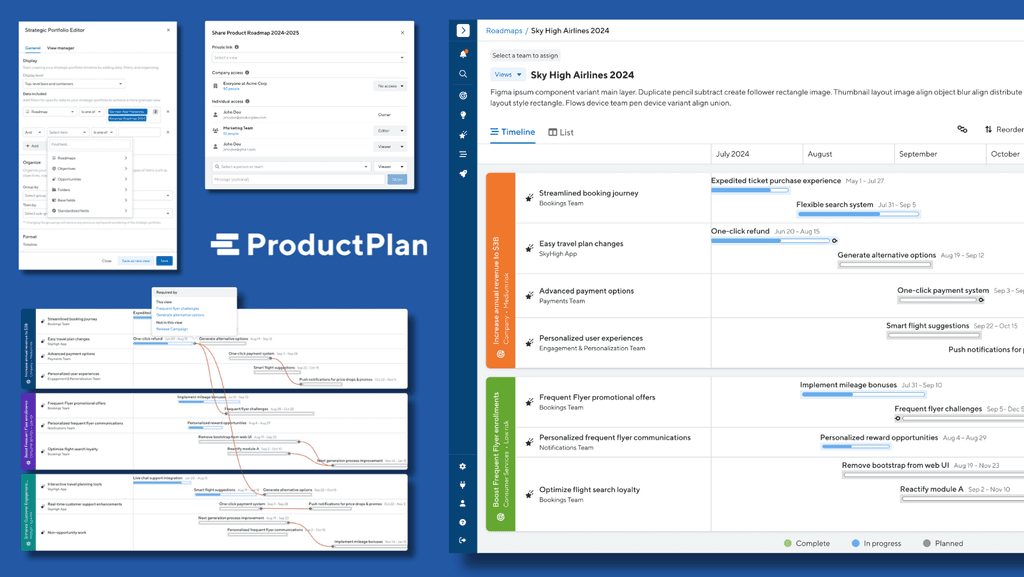
Bridging the Gap in Strategic Planning with ProductPlan
Driving strategic alignment with 54% month to month retention boost with portfolio visualizations
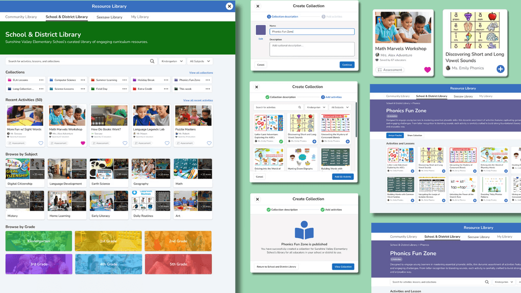
Curriculum Management for School and District Admins
Increasing Daily Active Usage by 15% through optimization of curriculum management
